Top Tips For Designing Your Social Media Graphics
If you’re a small business owner then its more than likely you are on some form of social media to help you reach, find and connect with potential clients... Am I right?
What social media platform do you AND your clients spend the most time on… LinkedIn? Twitter? Maybe you have a Facebook page? Or have you recently started a YouTube channel? Or is Instagram your “thing”?...
Whatever platform or platforms you use, are you making use of the cover photo, profile image and inner post images to the highest potential?....
Keep reading to ensure you benefit from my top tips for designing your social media graphics.
Design Software
I think it’s important to mention as a Designer, I use Adobe Photoshop to design my social media graphics for myself and my clients, however, although Adobe Photoshop is easily available, it is not free for long-term use.
Canva is a great free alternative. It's drag-and-drop feature and layouts are really helpful and make it easy to design as well.
Top Tip 1 | Keep it simple
This has got to be my first top tip as its so easy to get carried away. Keeping the design simple is better when it comes to graphic, web or design in general. If your social media graphics have too much going on with them it will just look ugly and is more than likely will confuse your messaging. Saying that the next few top tips will cover some essentials...
Top Tip 2 | Use visual elements
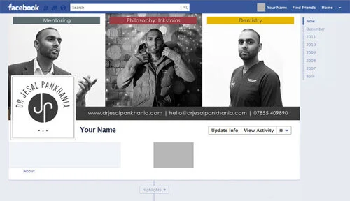
Visual elements, like great photography or images, are always a good idea when it comes to designing your social media graphics. Make sure the photography style is kept on brand and reflects your overall business and the quality of the images are high. If you plan to use more than one image, ensure you use a “grid” to balance each image, that is what I have done when I designed award-winning dentist, mentor and philosopher, Dr Jesal Pankhanias Facebook and Twitter cover images, see below.
Dr Jesal Pankhania - Facebook cover and profile image
Dr Jesal Pankhania - Twitter cover and profile image
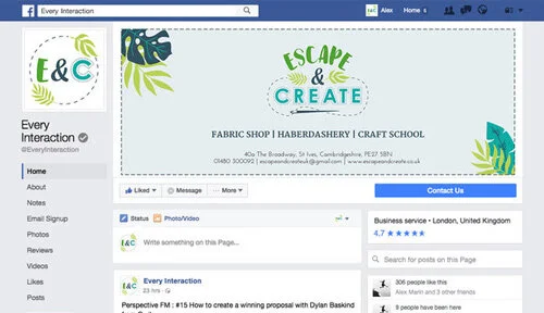
If you don’t have images to use or choose not too, it's not a problem, you can always use brand assets or patterns as I have done for Julie Miles’s business - Escape & Create.
Escape & Create - Facebook cover and profile image
Top Tip 3 | Keep it on brand
You will notice in the images above I have used specific colours and fonts, these are from the branding that I created for Dr Jesal Pankhania and Julie Miles. In the same light, when you design your social media graphics you should keep in mind your branding and use the correct fonts and colours that compliment the imagery or patterns.
With regards to fonts, ensure you use your “heading font” as a heading and your “body font” as body copy - IF you choose to add a heading or body copy to any images. Consistency is key.
Top Tip 4 | Make use of negative space
Negative space is generally described as the “empty” space within an image between elements. For example, I have added some text in the negative space for the WellbeingZone Facebook cover image.
Using negative space cleverly can be an effective and informative way to describe your service or product, or even share contact details.
Top Tip 5 | Keep it consistent
As I briefly mentioned above, consistency is key. Keeping your style the same across the different social media images - Facebook cover image, LinkedIn cover image, Twitter or YouTube cover image will help you maintain a professional image, and reinforce your brand.
Using the same profile image across all the different mediums will also help. If feasible, inner post images should contain some form of reference to your brand as well - so including your submark, or logo variation, and even details to your website/email address to some degree. Just be careful not to overdo it.
I hope you found these tips helpful and good luck if you are creating your own social media graphics.
What social media do you hang out on the most, and why?


