New Brand and Website For Discovery Analytical Consulting Ltd
The online world is a funny thing, isn’t it? We meet people on social media, through websites, and blogs, but we don’t really know who they are.
I met John Hicks through a facebook group. We arranged a convenient time to have a Skype call - I offer 30 min FREE no obligation skype calls to anyone interested in hiring me, to see if we are a good fit to work with each other.
It was probably one of the best skype calls I have ever had with a potential client. We hit it off right away. He told me about his freelance coaching business and we discussed my process and more.
The reason I am sharing this is because John approached me to see if I was a good fit for HIS client. He was screening me.
Being a digital designer who works with small businesses and startups, I don’t have a specific niche. Some may think this is silly, but I like to think of it as a way of being creatively challenged and keeping my business doors open to any small business or startup that has branding, website and other related design needs.
John contacted me a few weeks after our consult call and told me he and his client, Mark, were very impressed and that they wished to move forward with starting the project. Naturally, I jumped at the opportunity as I have never created a brand or website for a scientist who works with pharmaceutical and biotech companies. This was going to be interesting, and exciting at the same time! I couldn't wait to start!
1 | Client homework
As with every branding and website project, it is important to do research. I always ask my client to complete a questionnaire and create a Pinterest board so I can get a better understanding of their needs.
Mark used the words simple, bold, classy, clean and modern to describe the direction of the design.
Related:
Mark needed a little steer with regards to the Pinterest homework, so after a call or two, we managed to find some pins that gave me a good steer into the visual style he was drawn to for Discovery Analytical Consulting Ltd (DAC).
I realised, although I am very aware of my process and tasks, it is ever so important to make sure my client is also aware, so myself and Mark discussed the homework in depth and I made sure we communicated clearly to each other at every stage.
Related:
2 | Moodboard
With all the homework complete, I started on the moodboard. I say this a lot, but this is by far one of my favourite moodboards to date.
The crisp, clean lines and the round elements gave me some really awesome creative ideas. I couldn't wait to get going on the logo.
What adjectives do you think of when you look at the moodboard?
3 | Logo concepts
The moodboard got signed off straight away, which meant that I could now explore all the ideas I had in my head for the logo. I knew this was going to be more challenging than any other project I have worked on in the past as it was in a totally new industry. The logo is one of the most important aspects of the visual brand so I was keen to make sure it worked well for Mark.
I presented 3 logo concepts to Mark, which are always presented in black and white so that colour does not sway the decision, and because every logo should work well in one, flat colour.
Mark really liked concept 3, which played off of the notion of “finding a discovery” in a petri dish, however, he wasn’t keen on the petri dish. He did mention a “microtiter plate” so after another little creative brainstorm, I presented Mark with logo concept 2, which incorporated his feedback from the first set of logo concepts and any other revisions he had.
I decided it was best to add colour this time as this would help Mark really visualise the “discovery” aspect.
Needless to say, Mark loved the new microtiter plate logo concept and after some fine tweaking to the font, the following logo was signed off.
I was really happy with the final logo, I felt like we had really worked together to make sure we reached the right outcome. I also felt like Mark had definitely picked the right concept as I could easily see a secondary logo and submark based on the primary, signed off, logo.
This meant we were onto the brand development stage!
4 | Brand board
A brand board will help Mark stay consistent in his business going forward. It is a simple overview of his brand elements all on one quick reference document. It contains his primary logo, any logo variations, submark, patterns, fonts, and brand colour palette as well.
Related:
5 | Collateral items and Coming soon page
Once the brand board was complete and signed off I created the business cards:
...LinkedIn and Twitter graphics…
...and created a branded Coming Soon page with a Mailchimp sign up so that anyone visiting his website could sign up to his mailing list.
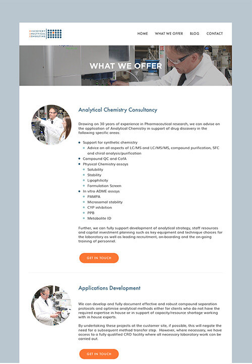
The design process ended with a fully functional bespoke Squarespace website.
6 | Squarespace Website
This was the last step in the design process and Mark was eager for his new business to have a professional looking website.
It was great fun putting all the brand assets - fonts, colours and design elements together on Mark’s website.
Check out the live site - Discovery Analytical Consulting Ltd
What do you think about this new brand and website for Discovery Analytical Consulting Ltd?


