New brand and website for PT PLUS
I've been crazy busy recently. Busy in a good way! Writing my own blog posts, guest posts for some well-known bloggers, and doing lots of small client jobs as well as getting a few big clients jobs done too.
One of the biggest projects to have kept me busy recently has been the brand and website development for my newest client, PT PLUS. Here's the behind the scenes post on how it all went down!
Sarah Cooke contacted me on behalf of Andy Reynolds the Founder of PT PLUS quite a few months ago about a website redesign for Andys interactive training platform - PT PLUS. As Sarah was my main point of contact I treated her as my client, however, kept Andy at the forefront of my mind as the main decision maker.
He wanted to give the PT PLUS website a new look and feel, with design leading the way forward. This meant he was open to the idea of a potential logo and brand redesign as he felt that the current brand was a bit "dated" and didn't quite meet the target market anymore.
I knew straight away that this project was going to be a great collaboration and so different from anything I had done in the past.
As Sarah started pinning images to her secret Pinterest board, that I had access too - I couldn't help but take a sneak peak every now and again! - my excitement to work on this project grew big very quickly!
She had a mixture of dark, yet bright, geometric and aspirational images. It was the perfect setting for a brand redesign.
The first stage was to create the moodboard. It was important to work with Sarah to get this right so that we were both on the same page with regards to the design direction for the brand and website.
I kept the moodboard beside me to remind me and give me ideas (inspire me) when working on a brand design.
Soon after I started on the logo concepts. I spent some time sketching with pen and paper before going full speed ahead in illustrator and creating a few concepts.
I tried to design 3 concepts to give to Sarah and Andy and asked them for thorough feedback on each one to find out what they liked and disliked, and what their first impressions are.
I don't tend to highlight which design I think works best at this stage for my client as I don't like to influence their decision in any way.
However, once I have had all the feedback I do explain the design decisions made behind each concept and then move things forward taking it to stage 2 with one particular concept. This was then worked on in detail and presented again to Sarah and Andy.
I was so excited presenting the final logo design concept, and I could see straight away on Andys face that I had hit the nail on the head!
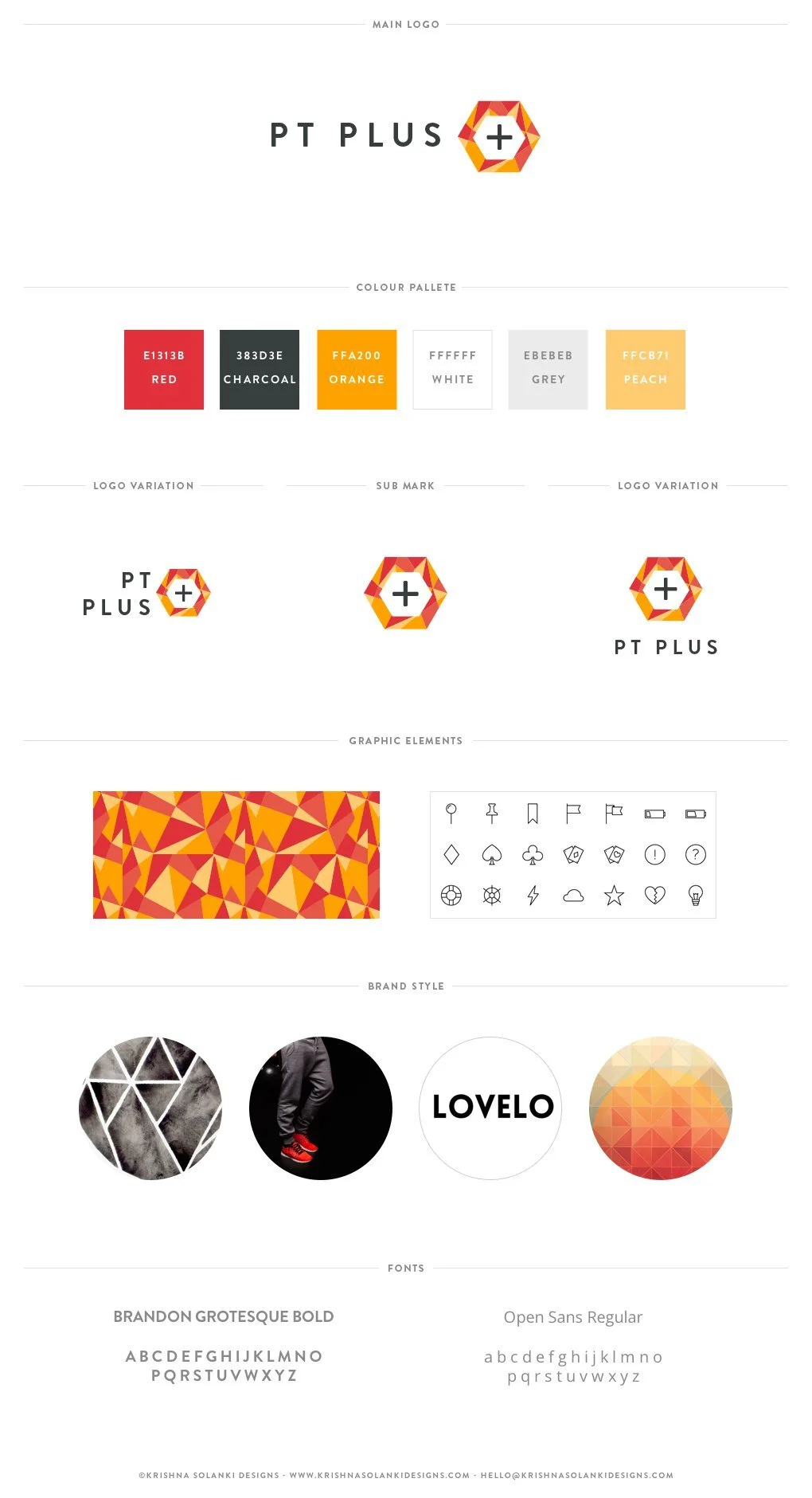
The logo was strong, bold, and had all the elements of bright fresh colours that they were looking for.
The logo encompassed details which could be broken down further and used separately to still represent the brand and keep it consistent.
I also provided variations of the logo which could be used in different layouts, ie as a Facebook or Twitter profile picture.
The PT PLUS brand was a pleasure to work on. The continuity of the colours in the logo, especially in the hexagon icon, meant I could split out the geometric style and use this element on other elements, like the favicon, and going forward the website theme design.
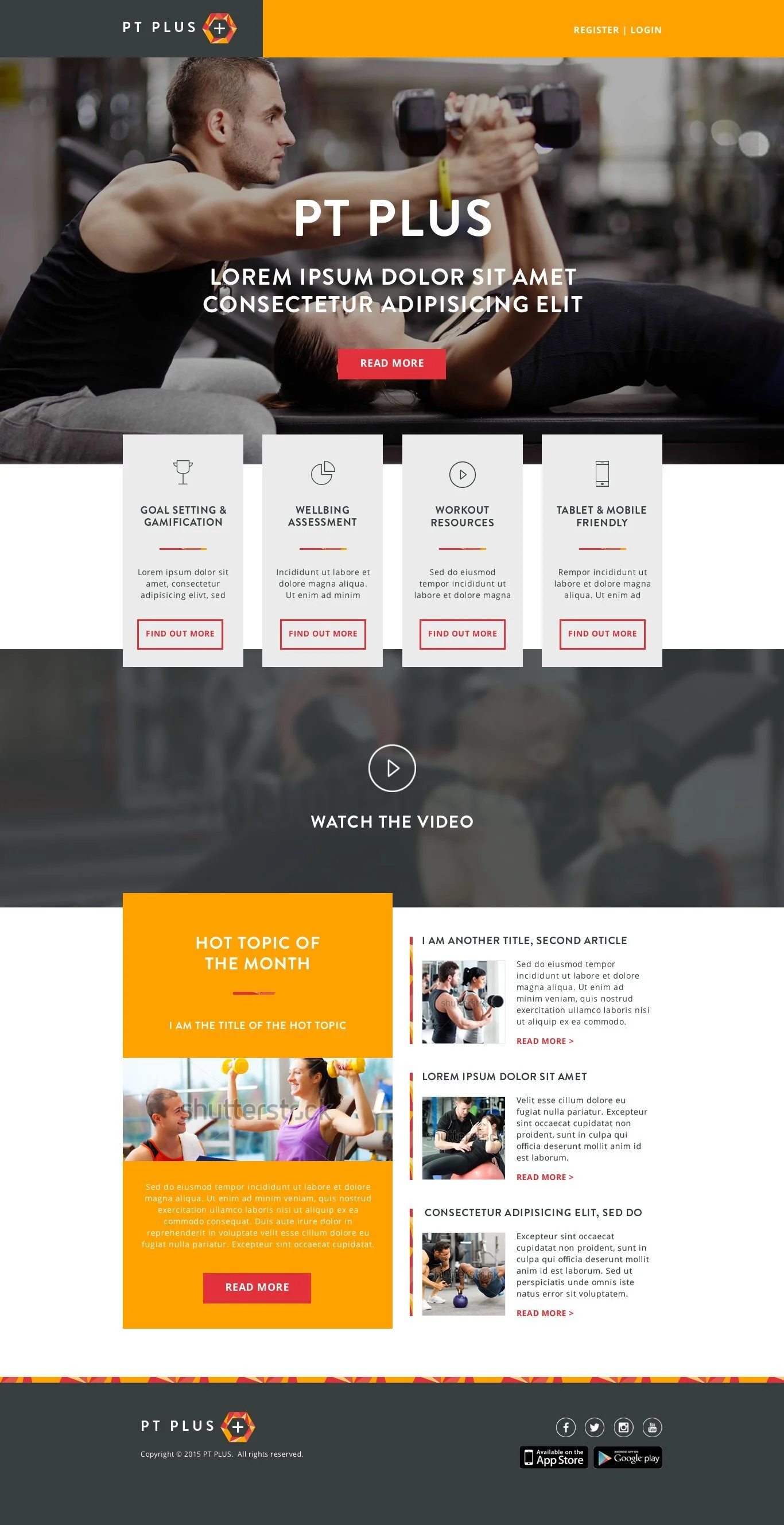
PT PLUS is one branch of Andys digital business portfolio, as a result this design is a theme. It is not the marketing site - that is currently being worked on so watch this space!
As this was a theme design it didn't require the usual "about us" blurb or "pricing" blurb, this was to highlight the features of PT PLUS and allow existing members to log into the system they are already signed up too.
I'm super happy with the design of the theme website and even more happy with the brand redesign. What really made it special was that Andy loves the outcome too.
What do you think of the redesigned PT PLUS brand and website?
Why not get in touch if you are after a redesign - I'd love to hear from you!


